echarts 的使用 之 柱状图 修改图标配置项,个性化图表样式
上篇已简单说过了echarts引用使用方法,查看可前往:http://blog.yunmell.vip/post/120.html
实现效果如下图: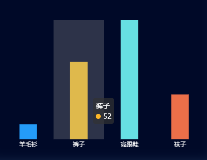
上图中dom容易背景色是自己定义的css,可根据实际情况进行修改
代码如下:
option = {
color: [‘#3398DB’],
tooltip: {
trigger: ‘axis’,
axisPointer: { // 坐标轴指示器,坐标轴触发有效
type: ‘shadow’ // 默认为直线,可选为:’line’ | ‘shadow’
}
},
grid: {
left: ‘3%’,
right: ‘4%’,
bottom: ‘8%’,
containLabel: true
},
xAxis: [
{
show:false,
type: ‘category’,
data: [‘羊毛衫’, ‘裤子’, ‘高跟鞋’, ‘袜子’],
axisTick: {
alignWithLabel: true
}
}
],
yAxis: {
show:false,
type: ‘value’,
splitLine:{
show:false
}
        },
        series: [
            {
                name: '',
                type: 'bar',
                itemStyle: {
                    normal: {
                        color: function(params) {
                            var colorList = [
                              '#249cf9','#fdb628','#67e0e3','#eb6f49','#27727B',
                               '#FE8463','#9BCA63','#FAD860','#F3A43B','#60C0DD',
                               '#D7504B','#C6E579','#F4E001','#F0805A','#26C0C0'
                            ];
                            return colorList[params.dataIndex]
                        },
              //以下为是否显示,显示位置和显示格式的设置了
                        label: {
                            show: true,
                            color:'#fff',
                            position: 'bottom',
                            // formatter: '{b}\n{c}'
                            formatter: '{b}'
                        }
                    }
                },
          //设置柱的宽度,要是数据太少,柱子太宽不美观~
         barWidth:35,
                data: [10, 52, 80, 30]
            }
        ]
    };

发表评论
评论列表
- 这篇文章还没有收到评论,赶紧来抢沙发吧~